
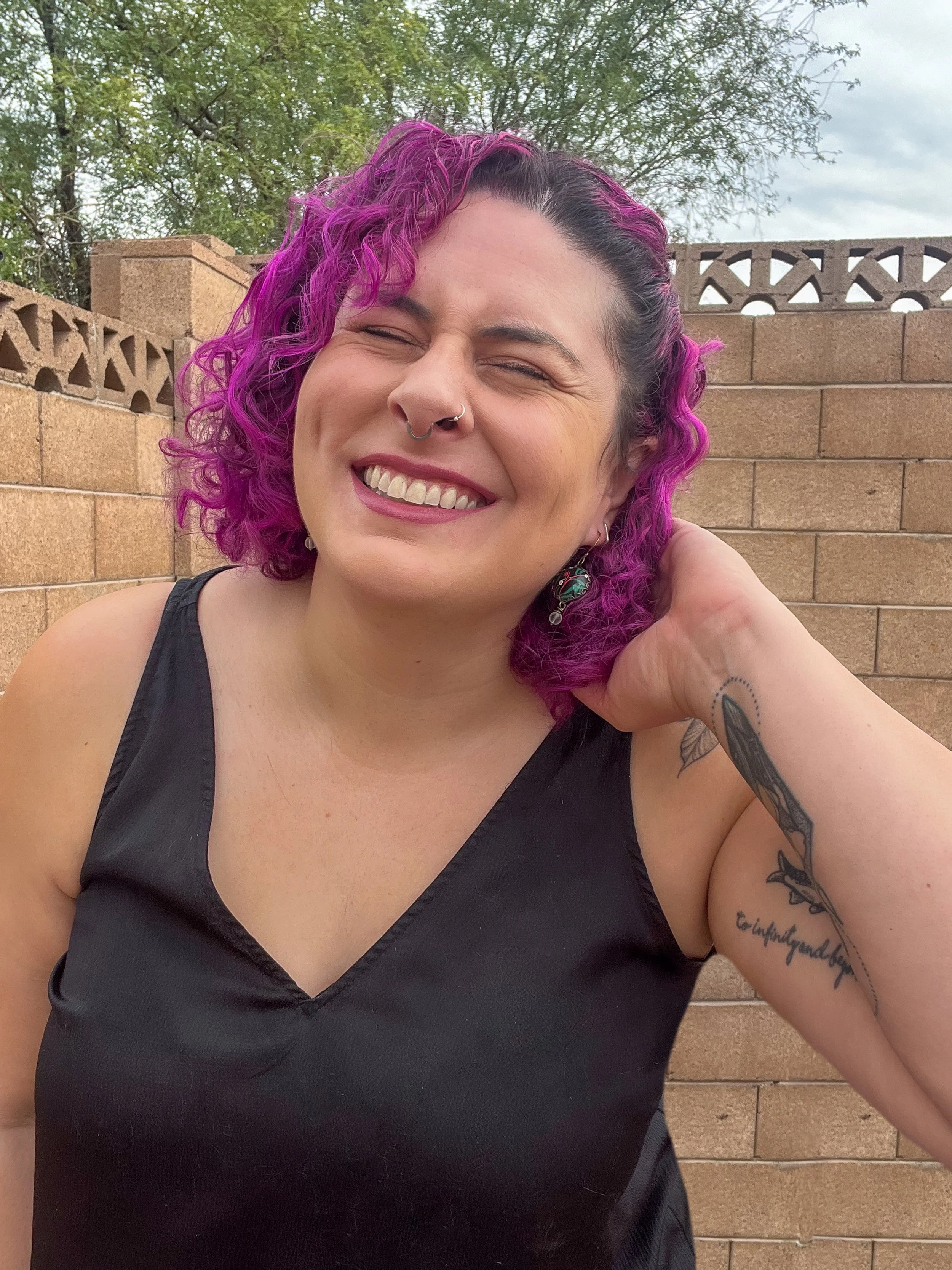
Hey, I'm Katie.
Hey, I'm Katie.
Designer, rule-breaker, recovering agency burnout case, and the brain behind Katie Rou Design.
FUN FACT:
The short version
I help unconventional businesses ditch the cookie-cutter shit and build brands that are bold, weird, and unapologetically real. If you've ever sat in a meeting where someone said "let's make it pop" and died a little inside, we're going to get along.
Heyy! I'm the face behind Katie Rou Design.
How I Got Here
How I Got Here
STEP 1:
Where I started
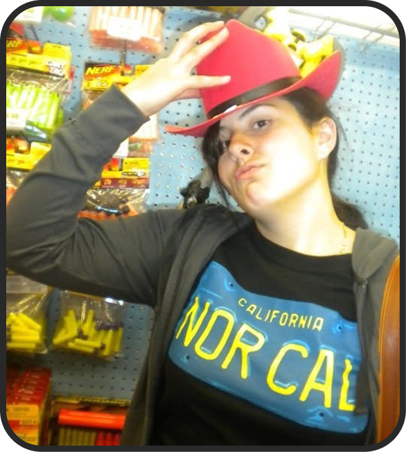
I grew up in a creative household where making stuff was just what you did. Painting, drawing, building, dressing weird, all of it. I never had a "what do you want to be when you grow up" moment because I already knew. I just didn't know what to call it yet.
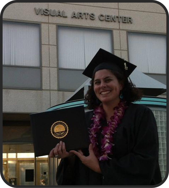
Eventually I called it graphic design and got my BA in it (with a minor in Printmaking) from Cal State San Bernardino. School taught me the fundamentals and a lot of theory I'd later have to unlearn. The real education came after.
STEP 2:
Real-World
Wake-Up Call
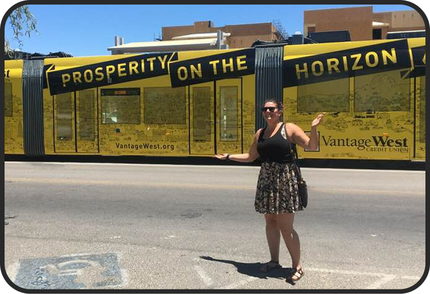
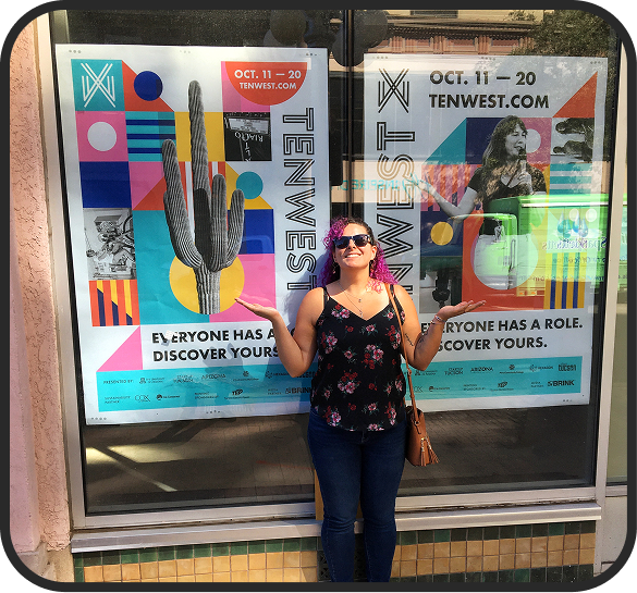
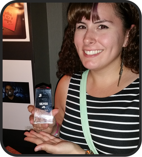
I started in the agency world. Big teams, small teams, in-house gigs, all of it. I designed everything from tourist brochures to social media ads for clients I'd never met. Some of it was fun. A lot of it taught me what I didn't want.
I learned how to work fast, manage clients, take feedback, and survive bad creative direction from people who didn't know what they wanted but were sure I was wrong. I also learned what burnout actually feels like, and what happens when you stay too long in places that don't value you.
STEP 3:
The "Aha" Moments
A few projects changed everything.
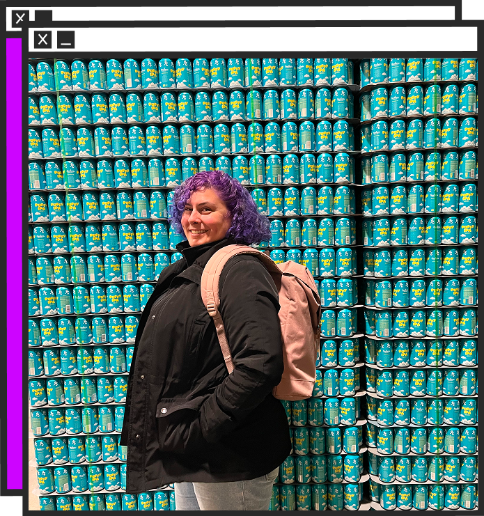
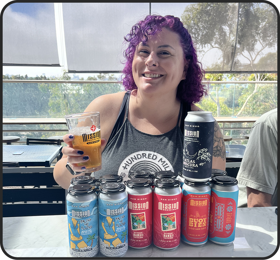
The first beer can I designed for Dillinger Brewing was the moment branding clicked for me. There's something about packaging that hits different. It's strategy, story, personality, and visual identity all stacked into one tiny canvas that has to sell itself on a shelf next to twenty others.
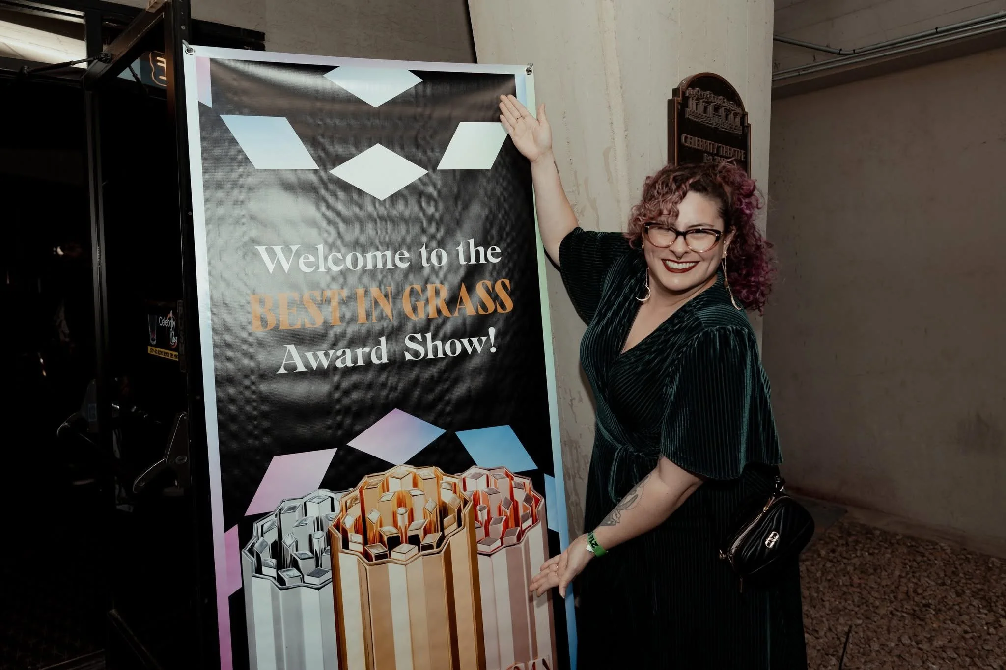
Then came the rebrand for Arizona Arts Live, a project big enough and personal enough that I knew I wasn't going back to agency life.
STEP 4:
KRD Takes Shape
I started freelancing on the side in college. By 2023, I'd had enough of toxic leadership, watered-down work, and ideas getting strangled by approval chains. So I quit.
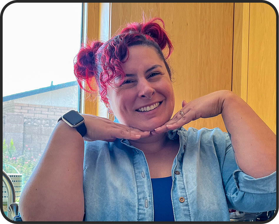
I took the leap, went full-time on Katie Rou Design, and built the studio I wished existed when I was on the other side of the table.
STEP 5:
How I think about Design
Great branding doesn't start with a logo. It starts with a personality. Mood, voice, the gut feeling someone gets the second they see your stuff. I care about strategy because strategy is what keeps a brand from being a Pinterest board with delusions of grandeur. And I care about visuals because pretty without purpose is just wallpaper.
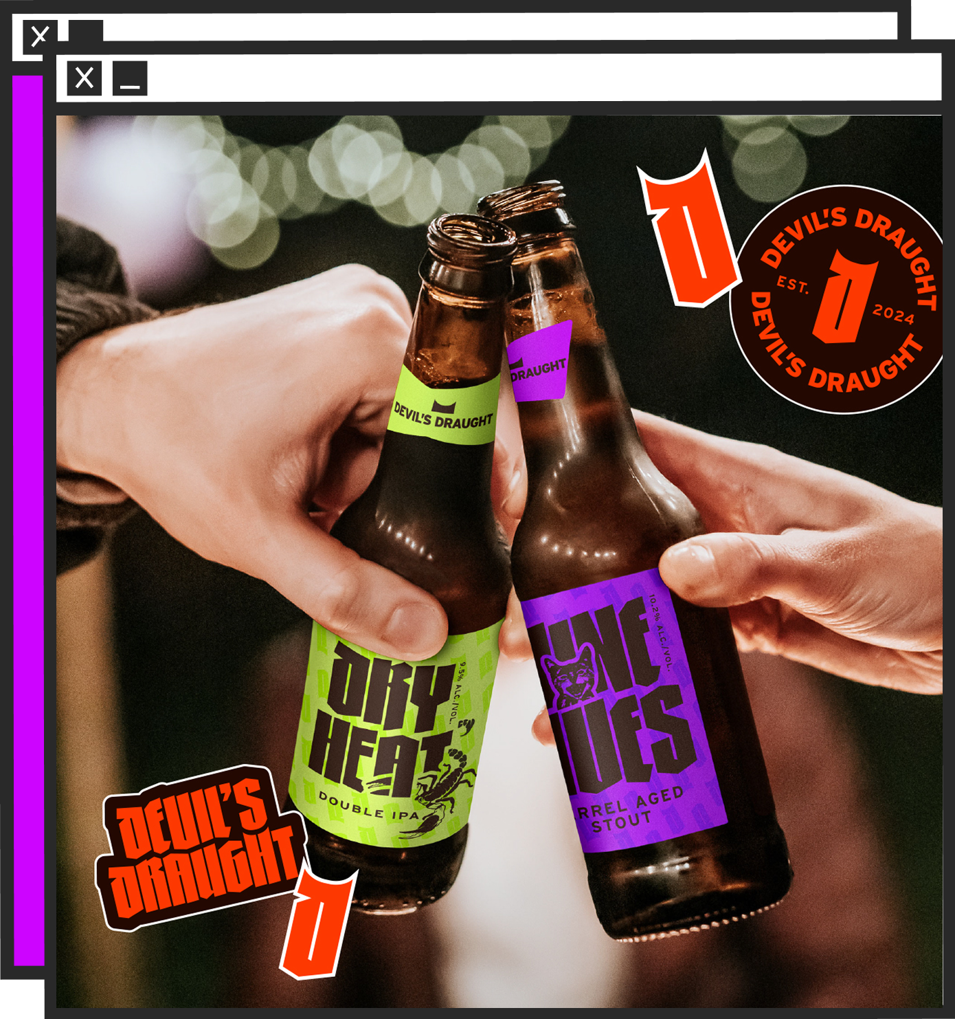
That's why I love branding and packaging. Branding is the introduction. Packaging is the close. One sets the tone, the other seals the deal. Both have to do the talking when you're not in the room. I take that seriously.
STEP 6:
Where I Am Now
These days I work with rebellious, alternative, and product-based brands that are ready to level up. Breweries, cannabis companies, events, founders building something weird and personal. If your brand feels stuck, DIY, or like it belongs to a version of your business that's three years behind where you actually are, that's where I come in.

What I
stand for
Are we a good fit?
Clarity Over Clever
I speak human. That means honest conversations, mutual respect, and decisions that serve the work, not my ego. Clever is fun, but clear is what gets remembered.
No Filter Needed
The best brands aren't watered-down versions of themselves. They're the real thing, weird edges and all. My job is to pull that out of you, not flatten it into something safe.
Design that Gives a Shit
I don't cut corners and I don't phone it in. Every choice has a reason, every detail matters, and every brand I build is one I'd happily put my name on. Because I do.
MY MISSION
Help good businesses stop looking like everyone else.
Too many great companies are hiding behind branding that doesn't do them justice. I'm here to fix that, one bold, strategic, unapologetically you brand at a time.
So if you’re a....
Brewery, cannabis brand, or product business
Ready to look as good as your product actually is? You're in the right place.
Founder or small business owner
Building something weird, personal, or unconventional, and tired of branding that flattens it out? Let's talk.
Established business outgrowing its DIY era
Done with the Canva-and-vibes phase and ready to look like the real deal? I got you.
You’re in
the right
spot
If anything you just read made you nod, laugh, or think "finally, someone gets it," let's build something together.